Faculty Spotlight 2019
The works in this show are nine out of the twelve paintings in the Prospect series. I began work on these paintings in the early summer of 2014. I was in Paris then and two things came together fortuitously. One was my wife, Valerie’s, dictate that we spend the morning in the very pleasant apartment that we were renting engaged in drawing, rather than (as is my wont) running all over town and knocking ourselves out. The other was my longstanding project of seeing (from the inside if I could and from the outside if necessary) all of Le Corbusier’s buildings that I could possibly visit in France. Paris and its environs has many of them and they are spatially complex (and hard to grasp), austerely sensual, modular and quirkily scientific in that machine-age way, idealistic, visionary, impractical, and aesthetically exhilarating. Le Corbusier was also a very good late cubist painter and his buildings were imbued with a painterly sensibility and his paintings with an architectural one. Looking and thinking about his work (and the buildings of other architects of his stripe, like Robert Mallet-Stevens) seemed to be a good place to start a new project, a fertile but suitably ambiguous point of departure.
Drawing is thinking, and that summer things coalesced – expanding and focusing in at the same time. Importantly, and I am still not quite sure why, the works demanded to be squares. They needed to be stable but charged with the possibility of being turned on their center point, to embody, in a fixed format, multiple points of view. In this installation at the Butler Gallery, the square format was extended – grouping the nine paintings in equally (and tightly spaced) rows of three. A question arose when I drew and painted them: were they plans or elevations, diagrams (with rooms and balconies) or fully fleshed abstract images? Visionary architecture might have been the initial inspiration, but they were scarcely architectural renderings. They felt like machines, but how rational were they – and anyway, what (especially now) does a machine mean? How did social and art historical references interact with the demands of the paintings and drawings themselves? There was color and there was structure, but their relationship was ambiguous -- was color structure or structure color? What (and where) were the foreground, middle ground, and background, and what was the relation between the edge of the image, the edge of the painting or drawing and the central forms? How did the internal structures morph from work to work? What changed and what was the same?
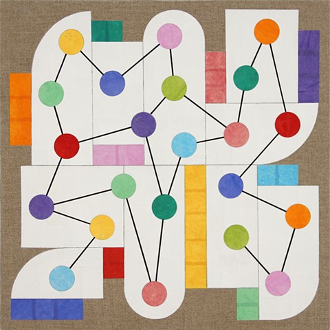
The paintings are built from a toolkit of components: panels, bars, circles, and complex linear connectors. They are constructed from painted and torn rice paper layered and collaged on linen. It is a complicated and rather tedious process but it allows for a particular matte surface and transparent color (paired with plaster-like whites) that is very difficult to achieve in any other way. There is also a governing, game-like logic -- a way of putting a rational order on sets of intuitive processes. In this case, the number of the internal panels matches the number of the color bars (and no color bar repeats) and the circles always come in two of each color. This sounds rather serious, but the paintings are meant to be playful and while they are at it, musical in a baroquely contrapuntal way. Importantly for me, they opened the door to my investigations of abstraction over the last five years.
