Jacqueline Martonik

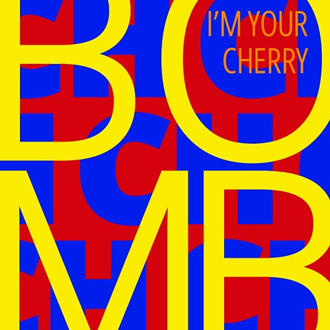
When thinking of a song or humming to the tune stuck in your head, the repetition of the chorus and emphasized words are usually what you remember first. Using music lyrics from my family’s collection of albums, I have created a series of typographic posters for my senior project. With each poster I experiment with scale, layering, and cropping within a set grid. To keep the posters looking consistent I have used the same typeface for all of them. The colors are referenced from the song’s album covers and the square shape imitates those of record and CD covers. Much of my inspiration came from designers and artists such as Experimental Jetset, Joe Amrhein, and Christopher Wool. The goal of this project was to create a new take on album covers by using the lyrics and typography in an experimental way.